ASOS / Nutshell
ASOS - Customer Care
The challenge:
Design a data dashboard that displays an overview of ASOS' business performance at a glance.
My role:
User research
Design workshops
Wireframes
Prototype
User testing
Visual design
The problem
The executive team at ASOS were constantly asking “How is the business performing?” but had no way to find out without asking an analyst to run a report or querying complicated data sources.
The current process of finding data, analysing it and then making a decision with the relevant people could sometimes take weeks. This lack of transparency was a constant barrier to making quick decisions in time sensitive situations, often leading to missed opportunities and potential losses in revenue.
User research
There were only 10 end users for this product - the executive leadership team at ASOS. Each of the executives covered different areas of the business so I had to take the time to capture all of their individual needs and understand the problems they were facing when it came to accessing business metrics.
This is actually one of my favourite things about working on enterprise products - you often have a small user base so you can get really great quality feedback and you can target your product very specifically.
To kick off the project I ran a workshop with the executive team, business analysts and data analysts to better understand the issues they were facing and to make sure we explored the problem before we began thinking about solutions.
I used the session to gather quantitative and qualitative data such as:
• The most common questions asked about business performance
• Context on when and where they were asking these questions
• The common pain points in finding/analysing business data
• The most commonly used metrics
• How they used their current tools
How is the business performing?
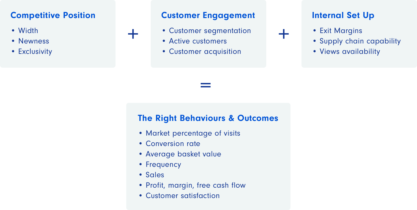
After defining the problem, we set out to answer “How is the business performing?” because it wasn’t just as simple as how many sales we were making. Working together we laid out the three key areas of the business that affected our performance and the main metrics that were used to measure success in those areas.
Adding these areas together lead us to decide on the high level metrics that equaled success at ASOS. Collaborating with the executives and analysts was essential to help me understand the problem because I'm a designer, not a business expert. I leaned on the analysts throughout this process to help me wade through the financial terms and complicated concepts which I was completely unfamiliar with.
Translating the data
The sources for all of the metrics that we identified in the workshop came in many different formats - there were reports, spreadsheets, dashboards and more.
I worked closely with the business and data analysts after the workshop to gather all of the data and translate it into more digestible formats. All of the data had a story to tell, it just needed to be found. As we combed through the data, we asked what story it was telling and which numbers were the main plot points.
Marking out these numbers helped us to decide on what would be included in the dashboard. We'd heard from the executives that they often had to wade through lengthy reports just to find a single data point so we worked hard to simplify and reduce unnecessary data.
Before moving on, we validated our newly styled data with the users to make sure that they were answering the right questions.
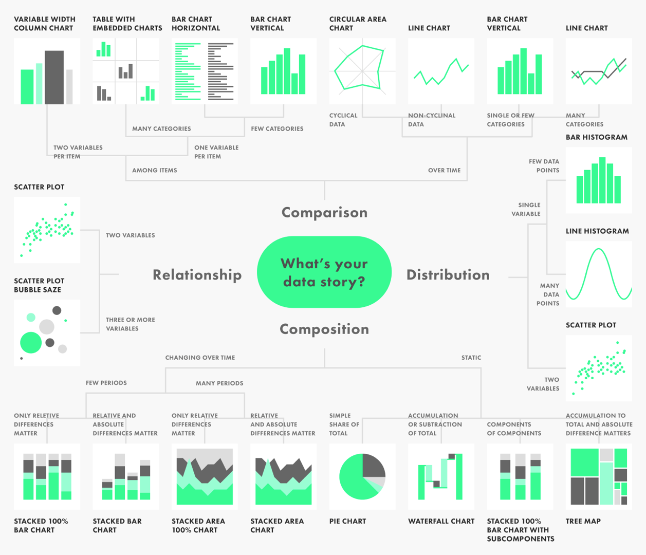
Data stories
As part of this project I drew up an infographic to help decide on the story we wanted to tell when it came to visualising the data. I wasn't able to include all of the visualisations that I wanted to in our MVP due to time and technical constraints but the infographic will be a useful resource when we come to design the next iterations of Nutshell.
Understanding the tech limitations
Before I started on the designs, I began working with the engineers who would be building the product to understand the limitations of the software. Our solution would be built in Power BI (a Microsoft analytics tool that allows you to combine multiple sources of data from separate databases) so we wouldn’t have the full functionality of a website or app.
However, the software had all of the features necessary to produce our MVP and all of the functionality we intended to build in the future. The only issue was that we would be limited on aesthetic choices such as layout and styling.
The solution
Working with both the analysts and engineers, we agreed on a solution that would bring all of the metrics into one dashboard that displays an overview of business performance in one place, allowing the executives to gain insights at just a glance.
There would be a lot of work required behind the scenes to bring all of these data sources together, so while they were working on the back end, I began working on the wireframes.
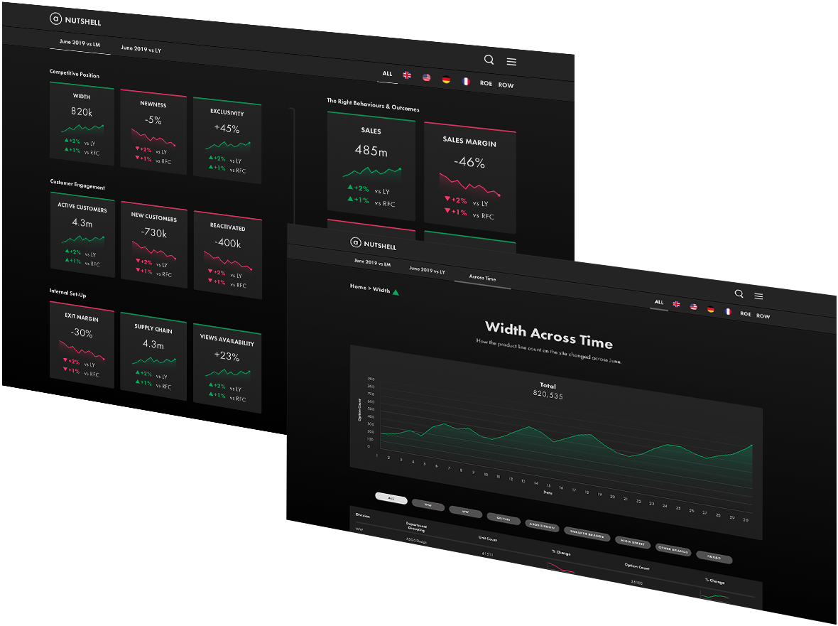
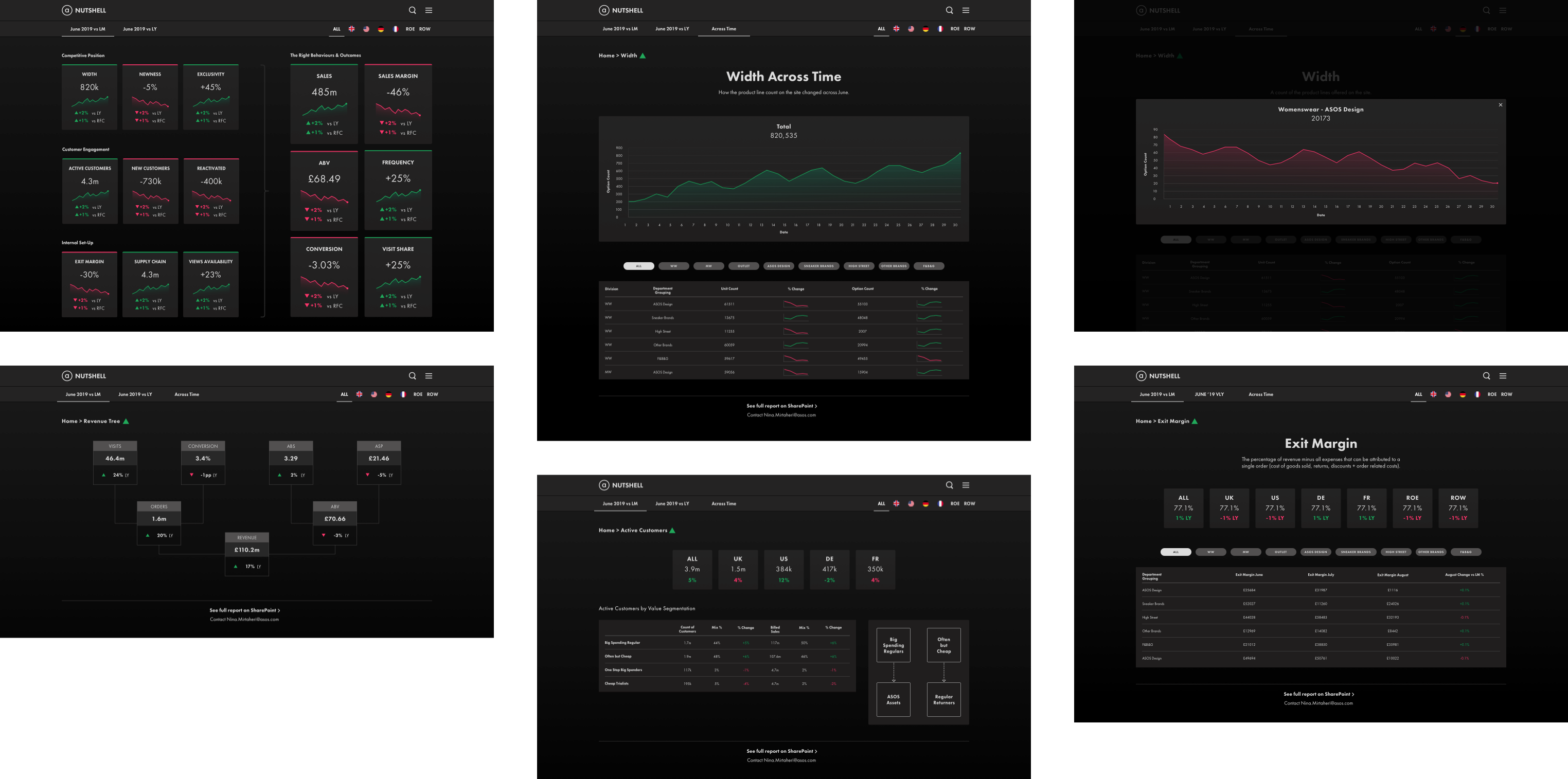
Performance at a glance
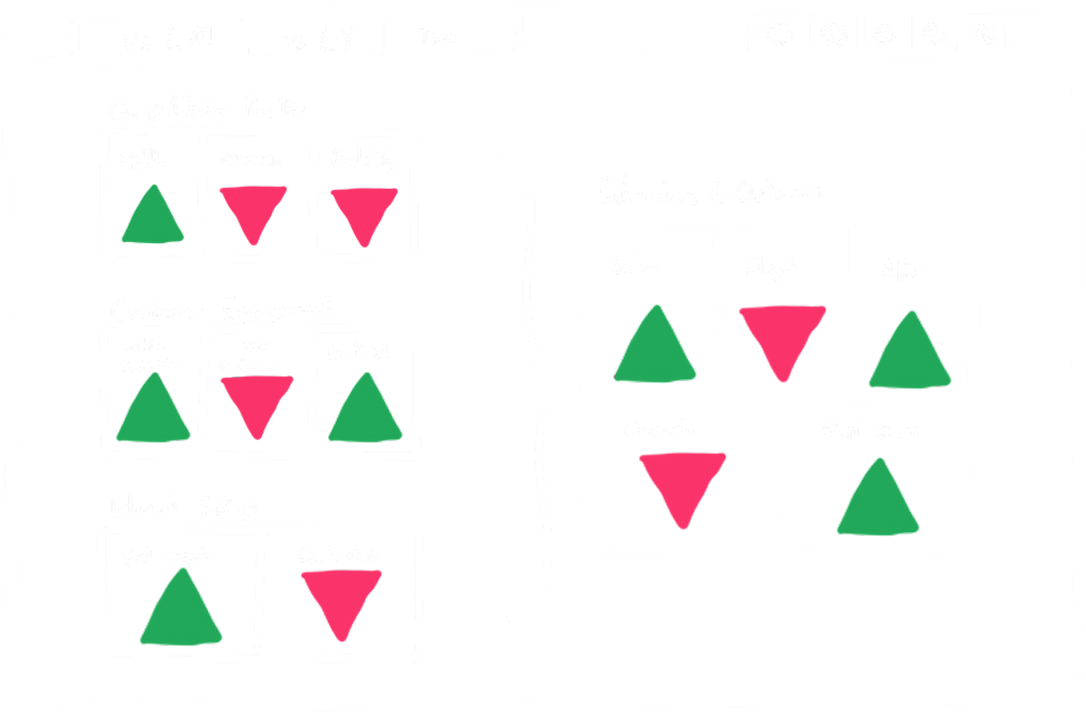
The design of the dashboard illustrates how the key areas of the business feed into the overall success. By using simple colours and shapes to denote positive and negative trends, the users can see how well each of the areas are doing at a glance. I went through many iterations of wireframes, validating the ideas with the executives to make sure they were happy with the solution.
During the executive workshop, we'd decided that the scope of this project was to provide an overview of the current month's data compared to last months and the current year compared to last year. The tabs "vs LM" and "vs LY" allow the user to switch between these two scenarios.
I also added filters for countries in the top right because the executives of different regions needed to be able to see the stats for their respective areas.
Digging deeper
While it was useful to see a high level overview, the executives would need to see more information. Clicking on each of the business areas would take the user to a detailed breakdown of the top level metric.
The wireframes included screens for each of the business areas that utilised our newly styled data. Consulting with the engineers, I added data visualisations to better illustrate the data stories. We weren't able to add as many as I would like due to time constraints but hopefully there will be scope to add more in later iterations.
I used simple tables for a lot of the data because the information needed to be accessible for each of the users and their different needs. If the scope of the project had allowed it, I would have added options to customise the data to the users personal preferences. This did not make the cut for the MVP but it is definitely on the list for V2.
I'd learned from our user interviews that seeing how the metrics have changed across the last month or year is important so I included an "Across Time" tab displays simple line graphs for each of the metrics. I worked with the engineers to add functionality that allows users to expand any line graph and see a detailed timeline.

User testing
After I’d drawn up the wireframes for all of the screens and validated them with the users and analysts, I put together a prototype for user testing. I started with lower fidelity designs for the prototype but quickly moved towards a higher fidelity as the deadline approached. We only had our engineering resource for a short time before they needed to move onto another project so we had to move fast and decide on the visuals early.
It was difficult to find time with the users due to their extremely busy schedules so we were only able to test the prototypes once or maybe twice with each user. We knew that this would be a constraint on the project so I kept a constant line of communication with the team and users, validating the solution at each step of the process. This feedback loop helped to make sure we were building the right product before we came to testing.
I chose to use a dark mode as this dashboard would be on a screen in the executive area 24/7 and I wanted to avoid eye strain during late night meetings.
The dark mode also helps to highlight the colours, while meeting accessibility requirements. Due to our small user base, I knew no one on the executive team was colourblind so the red and green wouldn’t be an issue.
To validate the design I tested the prototype with the executive team and asked them to complete various tasks while observing how they interacted with the design. The tasks were based on some of the most commonly asked questions that we learned about when interviewing the users at the start of the project.
For example, I asked the users “Can you tell me how many options we have for Womenswear in ASOS Design in Germany and how has that changed over the last month?”. I tested tasks for each of the screens, tabs and region segments to make sure that they were comfortable with the system. The design tested extremely well and all of the users were able to complete their tasks with ease.
The original home page of the dashboard was simpler and contained less data points because of my aim to keep the experience minimal and scannable. However, some of the users expressed that they would like to see certain extra data in the high level overview to provide context. I added the extra points alongside the high level numbers but kept them small enough so as not to distract when scanning the page.
Some of the users weren’t familiar with all of the business areas and terms so I added definitions to some of the pages. Again, I relied on the analysts to help me define these terms in a brief summary.
Results
The goal of this project was to empower our users to make higher quality, faster decisions. Thanks to the high level of collaboration, we succeeded with flying colours. The design portion of this project was completed in just a couple of weeks, which was only possible because all of the stakeholders, engineers and users were included from the very start.
This project has been a great opportunity to show our executive leadership the importance of product thinking. It's helped to show:
• How important it is to explore the problem first and decide on solutions later.
• That having a continuous feedback loop with your users mitigates risk and creates a product that your users want.
• Product design isn't just producing appealing visuals, it's solving business problems with design.
The dashboard has been built and is currently in use. Unfortunately we weren't able to include any tracking to measure usage statistics but we've been gathering feedback from the executives and the response has been overwhelmingly positive.
Due to the success of the dashboard, there is a “daily” version on the roadmap that the executives can use to see how we are performing at a more granular level day to day.
More case studies