ASOS / Customer Care
ASOS - Customer Care
The challenge:
Redesign the tool that employees use to solve problems for thousands of customers every day at the ASOS Customer Care office.
My role:
Design sprints
User research
Wireframes
Prototype
User testing
Visual design
Interaction design
Animation
Design system
The Problem
Customer Advisors are constantly hindered by the software they use to help customers. The unintuitive systems draw out interaction times, causing frustration for advisors and customers. Longer interactions cost the business money and increases the likelihood of repeat contacts.
The Goal
Design an industry leading customer support product that improves the workflow of Customer Advisors, allowing them to spend more time providing an exceptional service to our customers.
User Research & Data
During the planning phase of the project I spent a lot of time at the Customer Care office, shadowing and interviewing Customer Advisors to better understand our users. This time helped me to gather qualitative and quantitative data about how the advisors interacted with customers and solved their problems.
I worked with Team Leaders to learn more about the metrics they used to measure the productivity of Advisors. Understanding these metrics helped us to design a system that makes it easy for Advisors to succeed, which in turn improves the experience for our customers.
I also collaborated with Data Analysts to gather data on the pain points our customers faced and the most common reasons for contacting us. This data would help us later on when it came time to decide on the target for the sprint and what journeys we would prototype and test.
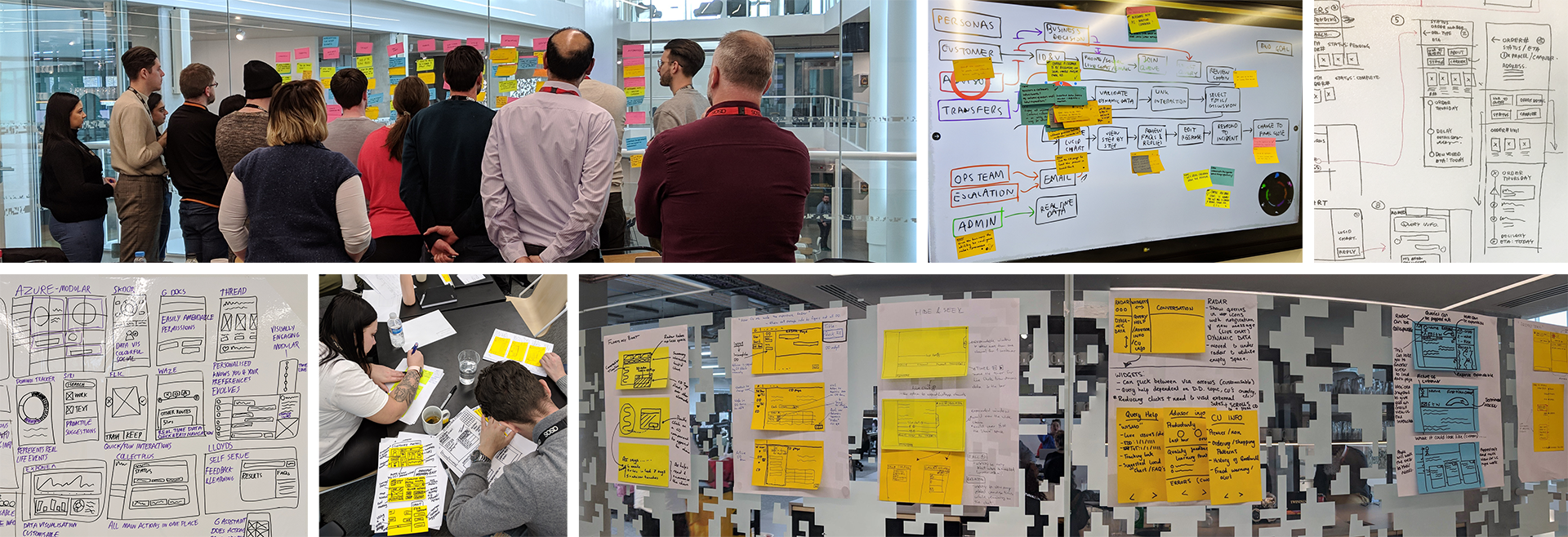
Design Sprints
I co-hosted several design sprints with a fellow designer over the course of the project. The first was a full 5 day sprint to decide on the overall concept of the experience, followed by many 1 to 2 day sprints to design various sections of the experience.
The design sprints included Product Managers, Engineers, Business Analysts, Customer Advisors and many more specialists. Including all of the stakeholders in this process ensured we captured all insights, problems & assumptions. It also helps to align everyone on the goal for the product. Utilising this wide range of expertise enabled us to tackle huge design challenges in just a few days.
It was important to me to include Customer Advisors at every point of the design. These are the people who would be using the software so I wanted them to have a say in how it worked. Having them on the team also helped us to gain invaluable insight into the behaviour of our customers and where the pain points of the current experience lay.
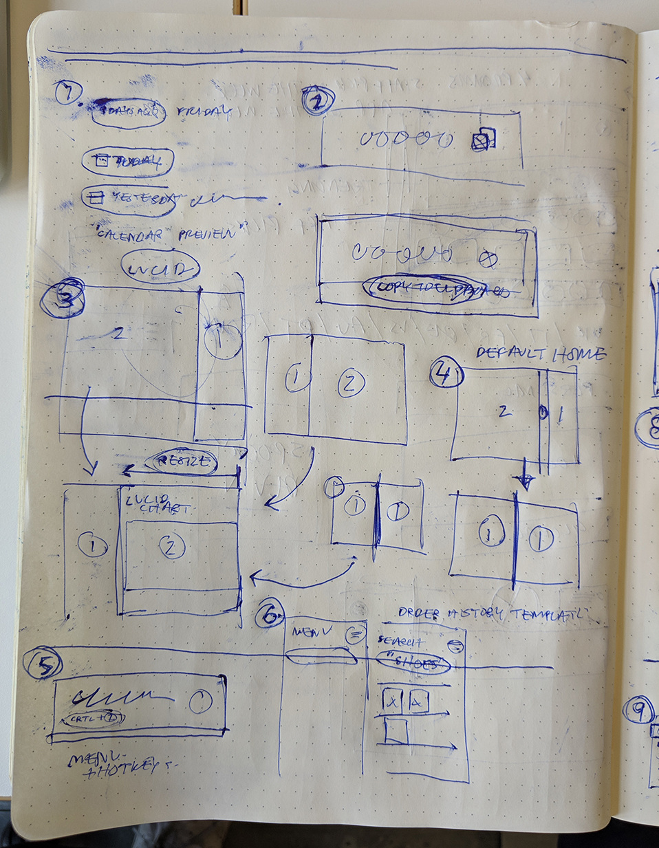
During these sessions we defined problems, decided success metrics, mapped out user flows, created storyboards, and sketched the initial wireframes that would inform the design.
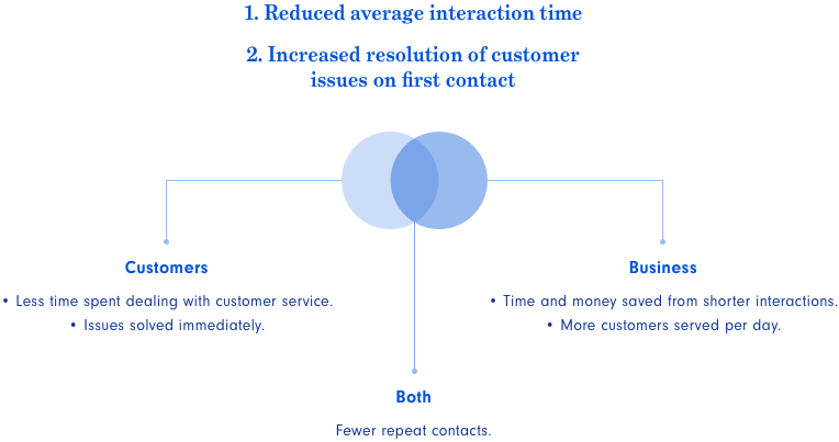
Success Metrics
The team decided on a set of criteria to judge our success based on the goals of the business and benefits to the users. Our primary metrics would be to drastically reduce the average time of each interaction with customers and to increase resolution of customer issues on their first contact with Customer Care.
We also decided on a few secondary metrics to measure:
• Decreased onboarding time for new Customer Advisors.
• Reduction of steps required to complete tasks.
• Improved quality of responses to customers.
• Customer and advisor satisfaction scores.
• Reduction of error rates.
Before
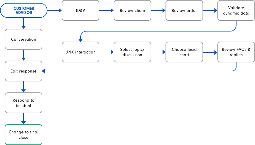
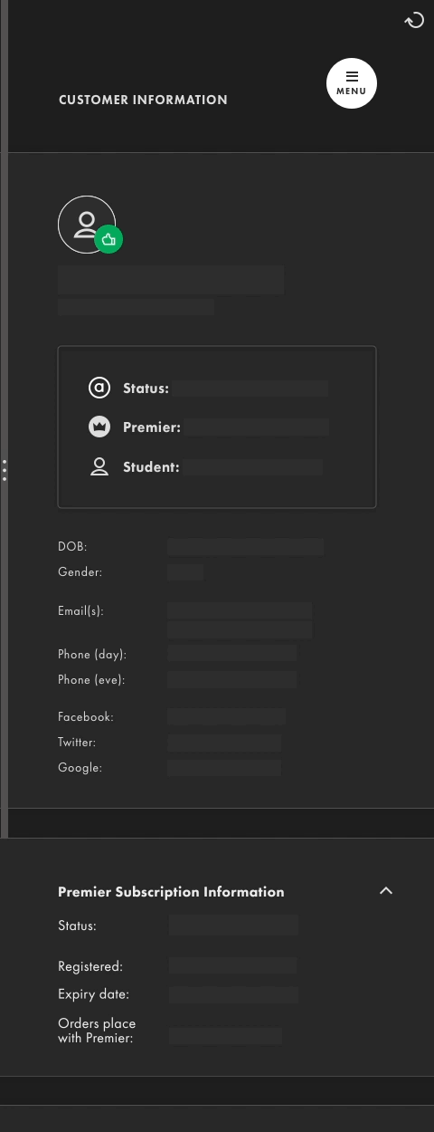
The current solution required advisors to horizontally scroll between two screens in one webpage; the chat portal in which they interacted with customers and the "customer details" screen where they retrieved information or performed admin tasks for customers. We learned from advisors that it was incredibly frustrating to scroll between the two pages all day.
After watching advisors use the customer details screen, it was obvious how the poorly designed interface was slowing them down.
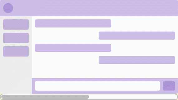
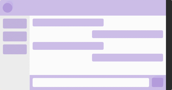
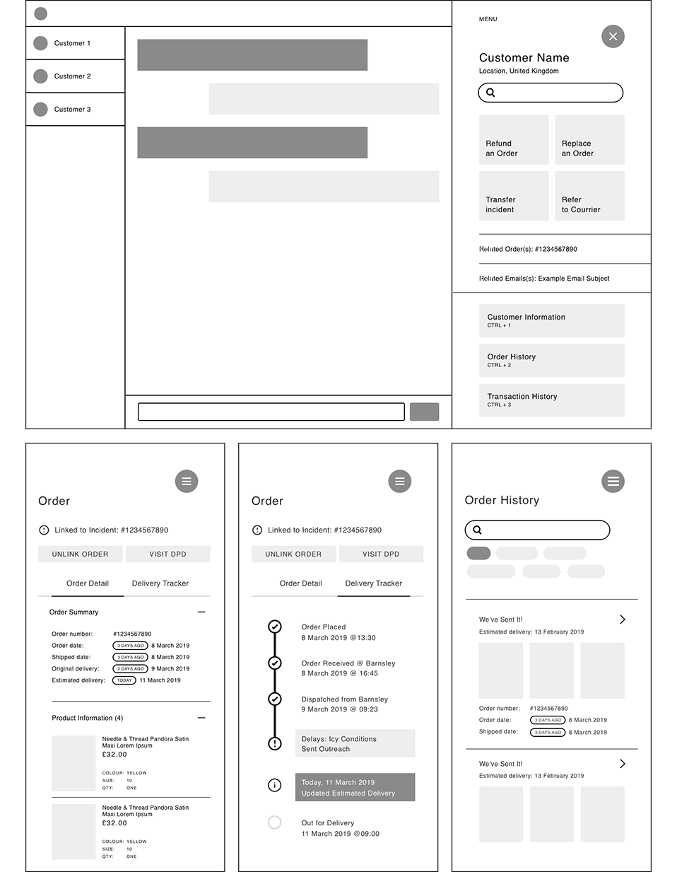
After
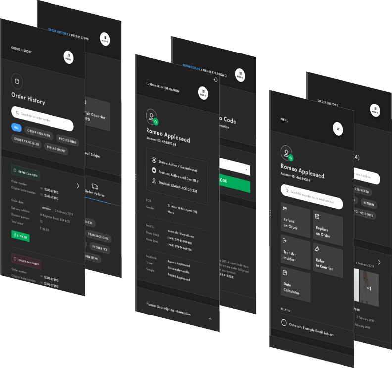
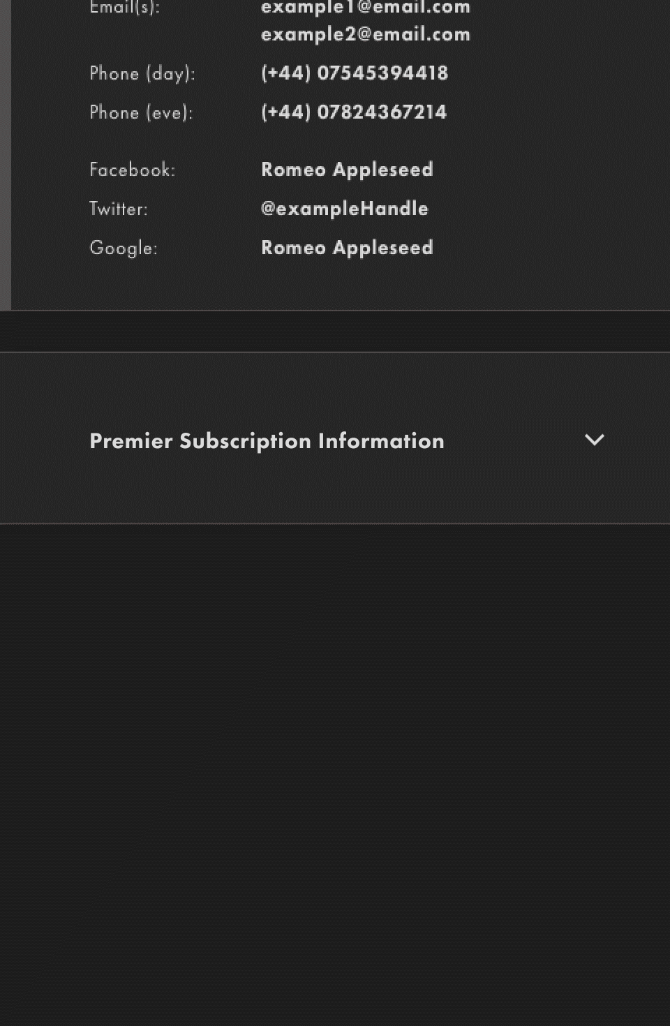
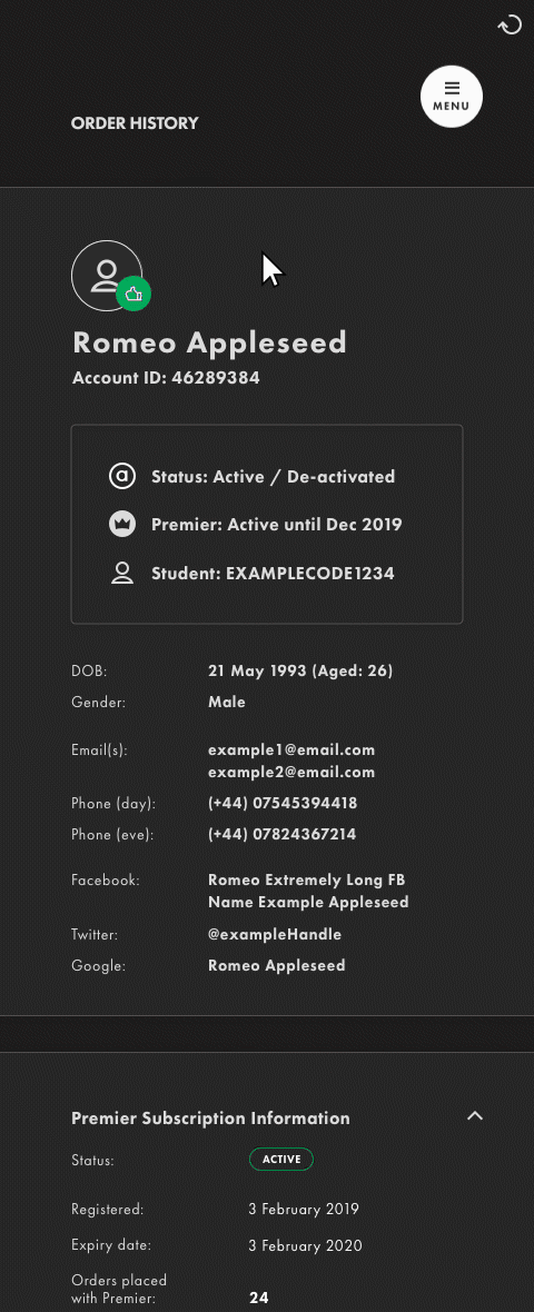
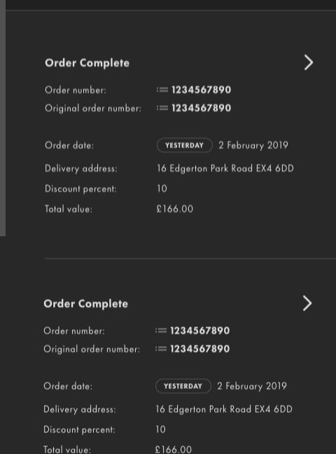
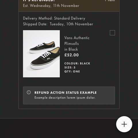
Using the insights gained in our research, interviews and design sprints, we decided on a solution that condensed the "customer details" screen into a neatly contained panel that expanded from the right side of the page. This would allow advisors to complete all of their tasks without leaving the customer interaction page.
We worked with the advisors on every screen of the new panel, streamlining every task to be completed in just a few clicks.
Wireframes
Using the sketches from the design sprints, I mocked up the general concept of the experience and main screens in low fidelity wireframes.
I validated the function of the wireframe flows with Customer Advisors before moving on to the visual design. It was essential to collaborate with the end users of the systems to create solutions that allowed them to complete the complex tasks.
The wireframes were also validated with Engineers to make sure that the designs worked within the technical constraints of the project.
The wireframes went through many iterations as we ironed out the details of each screen.
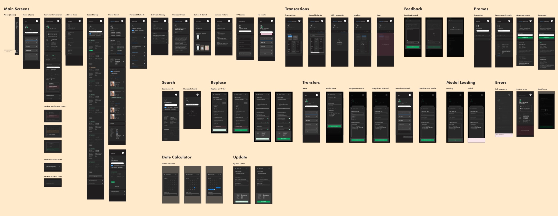
Visual Design
The chat interface is a separate application that will remain the same for now so my focus for this project was only on the side panel design.
The visual language of the experience uses many elements of the customer facing ASOS design system. Reusing components from the customer design system helps to onboard Customer Advisors as they will be comfortable navigating a familiar interface.
We chose to use a dark theme for the side panel to provide contrast to the chat interface. The dark theme also reduces eye strain for users, while still meeting minimum color contrast ratios for accessibility.
The below screens are just a handful of the designs produced for the experience.
User Testing
I ran 10+ moderated user testing sessions (with the help of a fellow designer) at the Customer Care office throughout the design process, constantly refining the experience, ironing out issues and capturing feature requests. I also invited the other stakeholders on the project to come along so that they could see our solution in action and help to take notes on the sessions.
I created a prototype to test the complex scenarios that the Customer Advisors faced daily. The prototype mimicked interactions with customers facing the most common issues - including order updates, cancellations, referrals, customer verification, replacements, refunds and transfers.
Participants were asked to complete these tasks without any help or prompting. Despite this being an entirely new and unfamiliar system, the participants always managed to complete their tasks with ease - thanks to the intuitive design produced with the help of the Customer Advisors.
The user testing was vital to validate the systems we designed before moving on to development.
Interactions & Animations
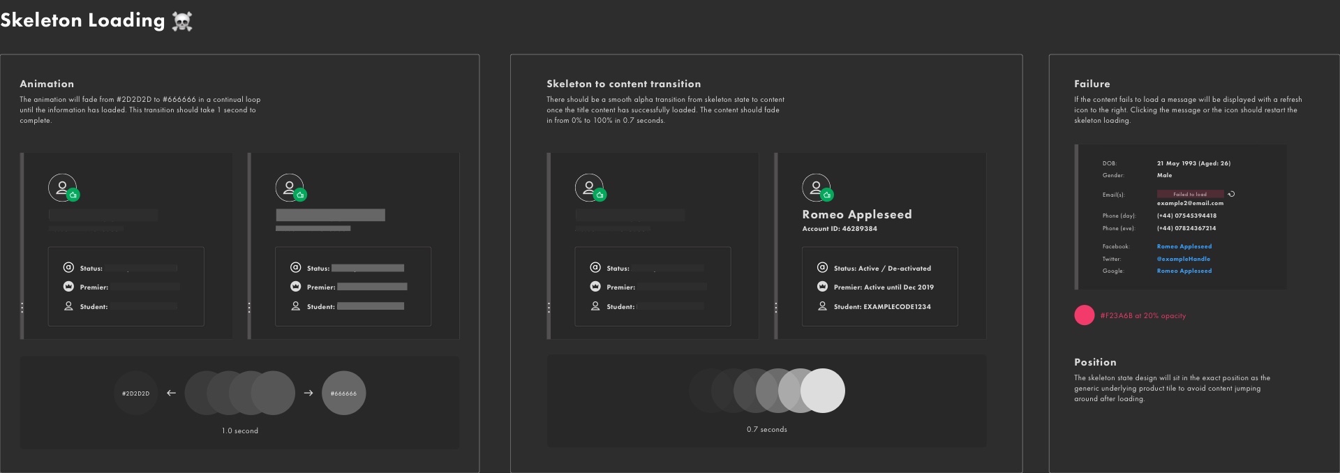
I created snappy animations for interactions throughout the experience as I wanted it to be delightful to use, as well as functional.
Adding animations to interactions focuses attention on what's important, without creating unnecessary distraction. In the examples below, I used animation to inform users by highlighting relationships between elements, provide feedback and indicate the status of actions.
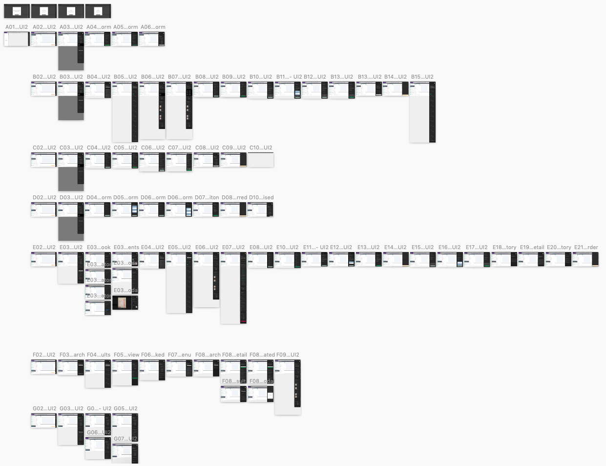
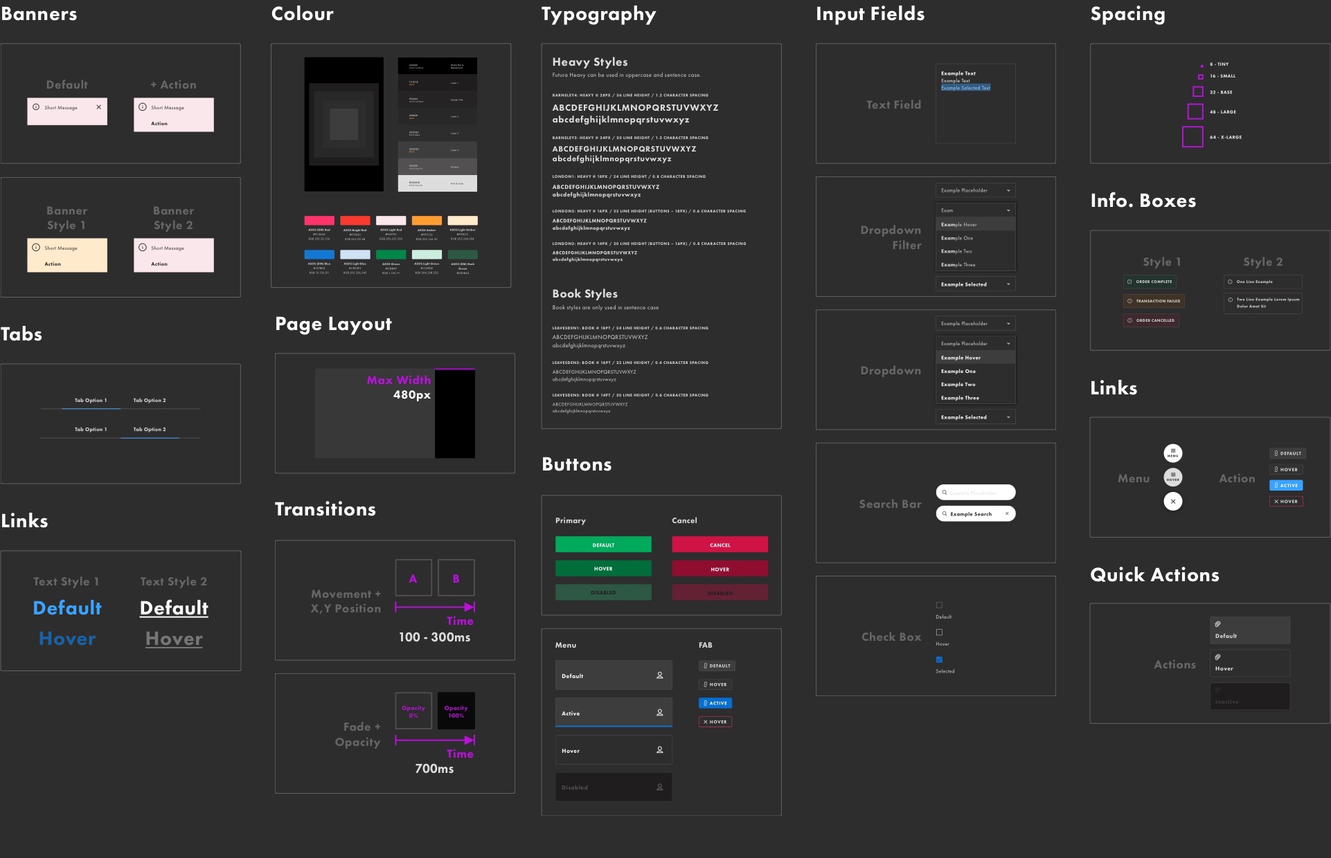
Design System
During the design process we began to produce a new design system. This system helped to maintain a consistent design language while also reducing waste by reusing components.
It was also extremely useful to Engineers when it was time to hand over the designs. Having a detailed system of components to refer to helped to speed up development.
Accessibility was accounted for in every step of the visual design and was a guiding principle of the new design system. The system contains guidelines on colour and contrast ratios, visual hierarchy, interactions, navigation, layout and typography. These specifications were crucial to ensure that the new system was usable for all of the employees at ASOS Customer Care.
Animation Specs
I also included detailed animation specifications in the design system to remove any guesswork when it came to development.
Results
This project was a perfect example of the power of bringing together a diverse team of people to solve a problem. By including all of the stakeholders in the design sprint, everyone was aligned on the direction we wanted to take and bought into the product vision.
The new experience is currently in development with launch set for late 2021. While we won't have data to measure our success metrics until we get it into the hands of our users, we have received great feedback from pilot tests that have been run with early versions.
The whole team worked incredibly hard to make this a great product for our users so it was very rewarding to hear that users in the pilot tests mentioned how much care has gone into the new design.
"Thank you for giving us the opportunity to be part of the app pilot, and for all the effort you guys are putting into doing the best thing for us."
"It is very much appreciated knowing how much you guys care about how we feel with this new change, so well done."
"It looks awesome, please stick with black and keep it compact on one page if possible without being necessary to scroll left and right."
- Customer Advisor feedback on pilot test
More case studies